Visual Image of TCL CSOT Brand Upgrade Showing Scientific and Technological Wisdom between Inches
It has been 14 years since the establishment of TCL CSOT in 2009; over the years, it has been investing over 260 billion Yuan in the semiconductor display industry, which has helped the domestic panel to catch up with and surpass the foreign semiconductor display industry and become one of the world's leaders in the semiconductor display industry. TCL CSOT has always been adhering to the development concept of "open innovation, cooperation and win-win", and is committed to creating the world's leading brand image of intelligent technology.

At the beginning of the New Year, TCL CSOT released a new LOGO, and the brand recognition system has also been fully refreshed. The new logo represents not only a change in appearance, but also an overall upgrade of TCL CSOT brand value.
![]()
The firmness and softness between inches blend with the reality inside and outside the screen
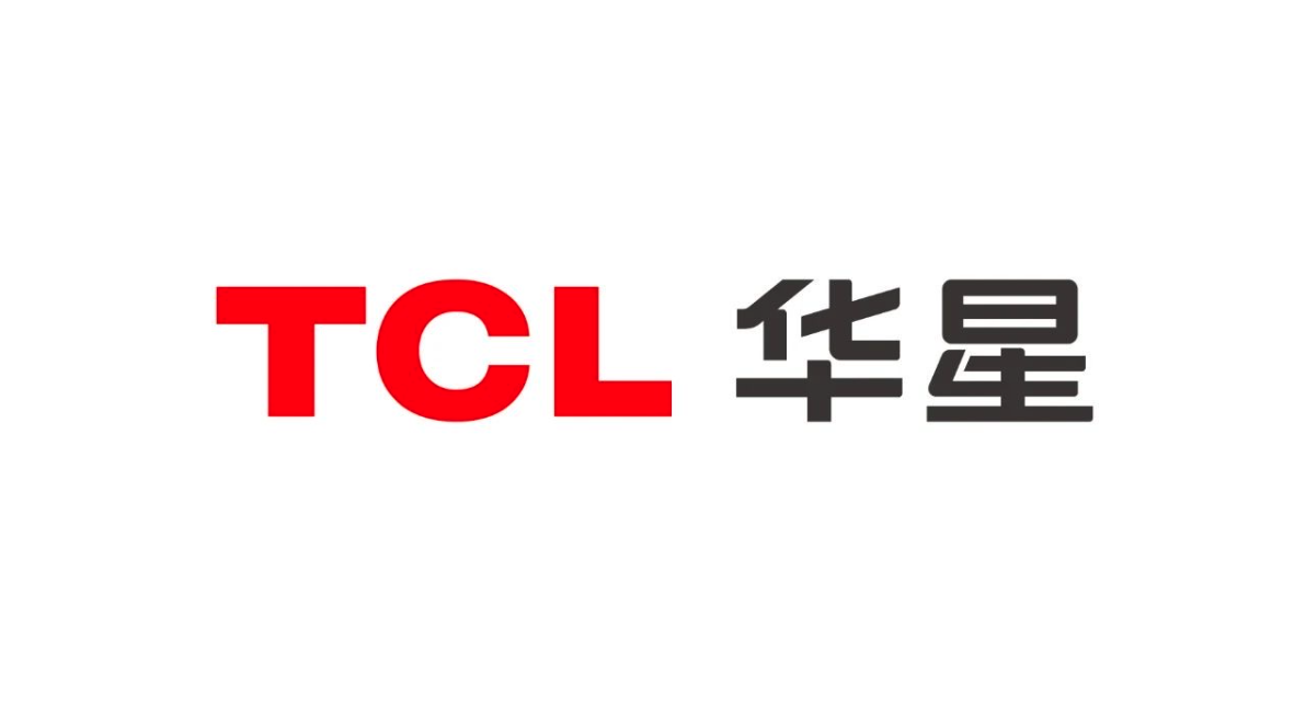
TCL CSOT’s new Chinese LOGO font design inherits the core concept of TCL graphics square circle, follows the design principles of rounded corners and straight lines, making the overall font have a sense of stability and smoothness with both hardness and softness, which reflects both the rational scientific spirit and the perceptual human concept.
We square the upper end of the Chinese character "华" and round the lower end of it to reflect the concept of square and circle. The Chinese character "星" is subject to joined-up writing and special stroke processing, which makes the font more design-oriented and recognizable. The turning angle of the joined-up writing also symbolizes the angle of the screen turning angle.
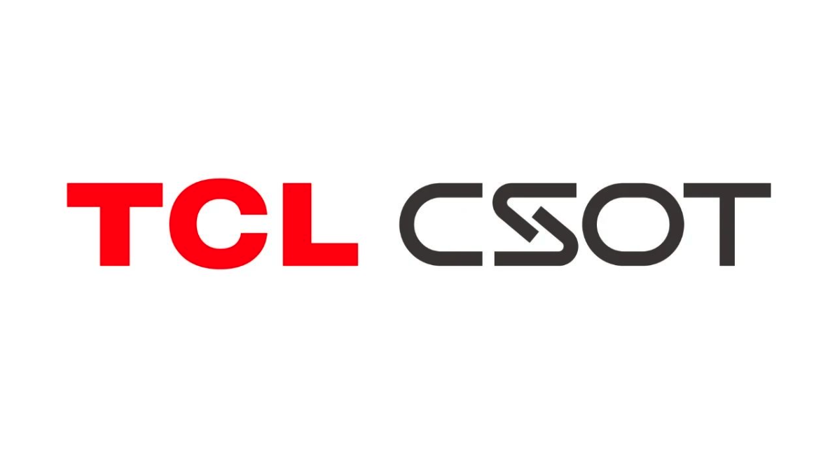
TCL CSOT’s new English LOGO font design selects S as the representative symbol; “S” represents Screen, illustrating the design concept of the world inside and outside the screen. The left corner represents the display world inside the screen, the right corner represents the real world outside the screen, and the virtual coexists with the real inside and outside the screen.
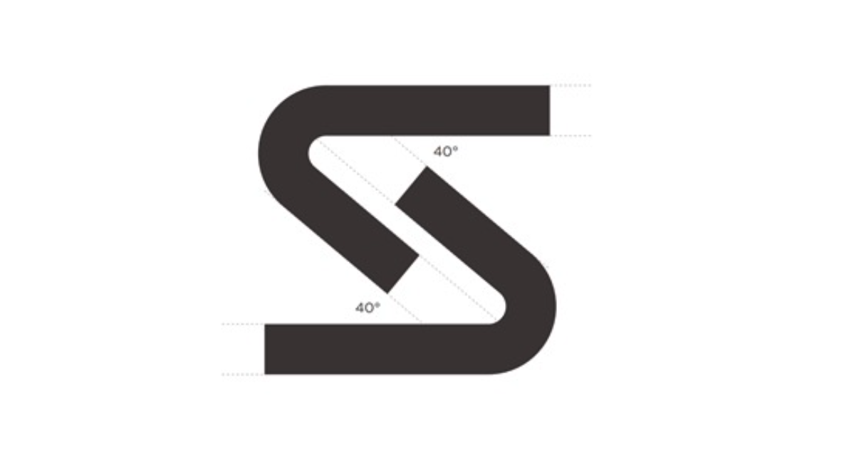
The overall font follows the design principle of rounded corner and straight lines, allowing the overall font to retain professional stability while still having a smooth and soft feel.
![]()
Brand Color Flexibly Deducing Brand Personality
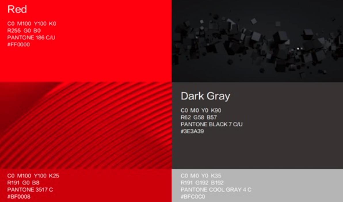
Color is an important element in the brand visual recognition system. It can effectively distinguish and emphasize the difference and uniqueness of the brand image. TCL CSOT takes red, black and gray as the standard color, and has strong brand color appeal, more vitality and hierarchy, which further highlights the brand personality of TCL CSOT intelligent technology.
![]()
Auxiliary Graphics Extending Brand Energy Infinitely
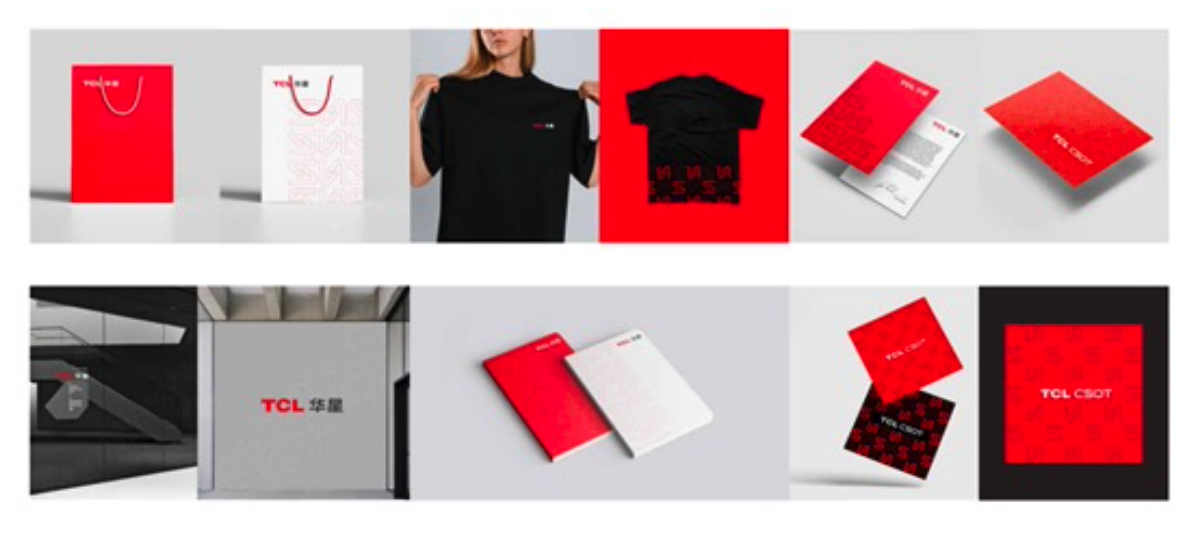
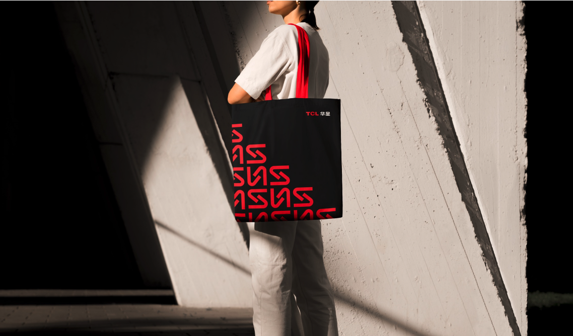
Auxiliary graphics are the visual presentation of the essence of a brand. TCL CSOT brand new visual VI auxiliary graphics, with the "S" element as the origin, construct the real world outside the screen, the excellent display world inside the screen; the virtual and the real coexist and complement with each other. And it can be applied flexibly in the core administrative materials, external promotion and dissemination and other scenarios, further strengthening the brand characteristics.
![]()
New LOGO Application Refreshing New Year's New Image
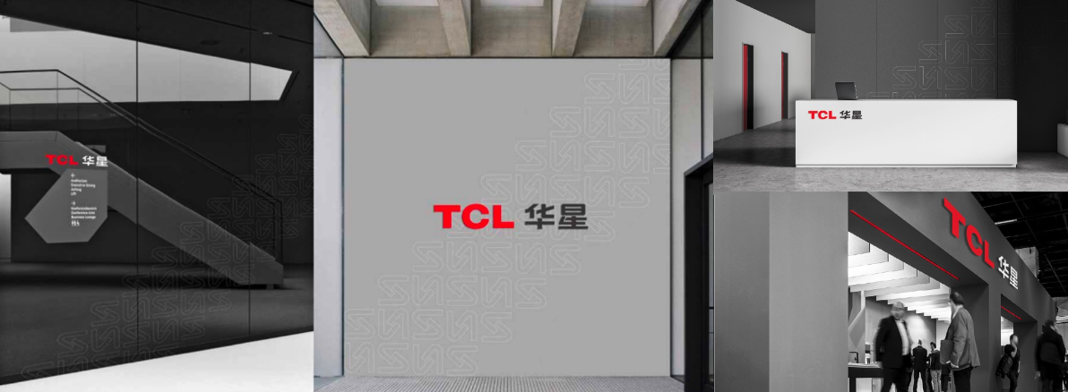
After the brand LOGO has been completely refreshed, the original logo of the Building in TCL CSOT Park and the official website has also been replaced with new LOGO, which presents a new overall style.
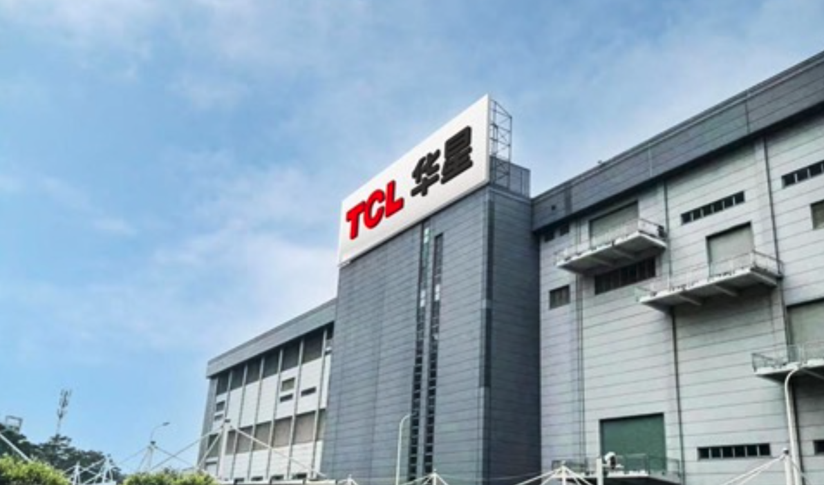
LOGO Upgrade in TCL CSOT Park
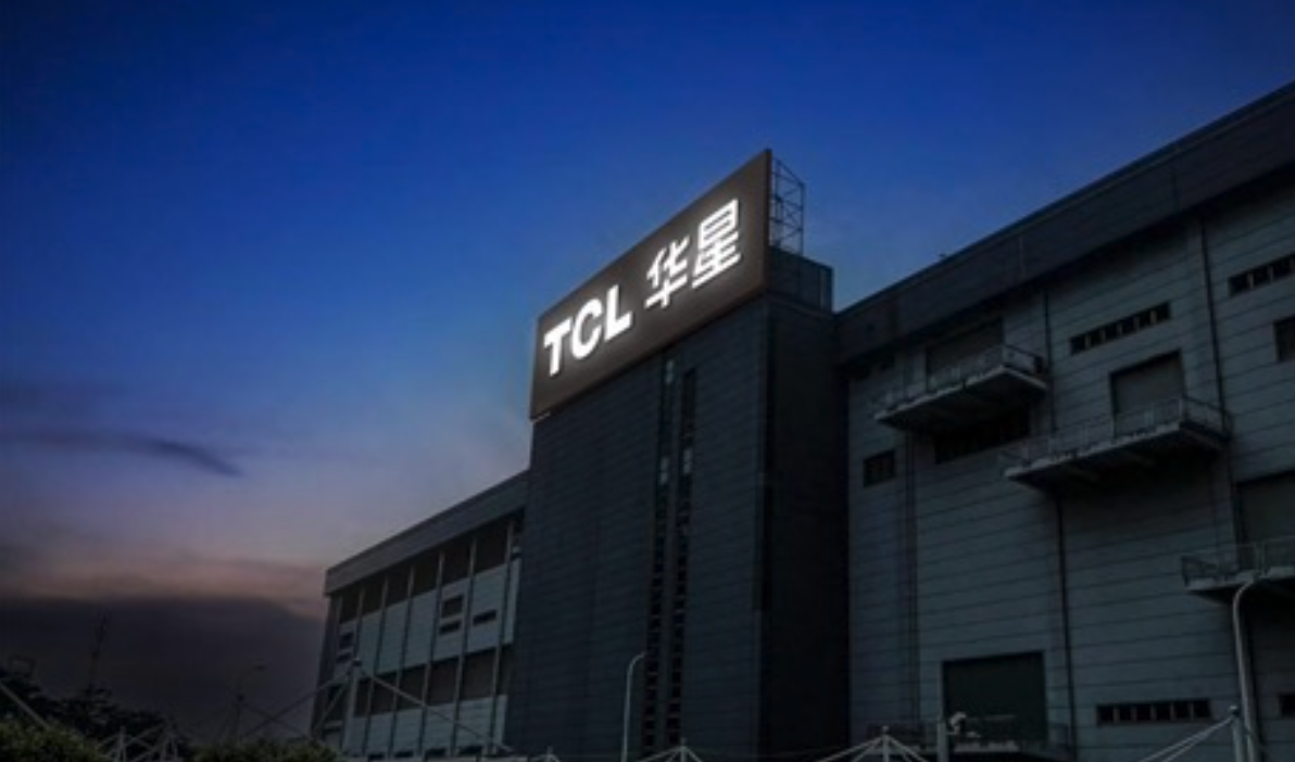
LOGO Upgrade in TCL CSOT Park
Finally, in order to better present the design concept of TCL CSOT's new LOGO, we have also designed a new peripheral application of TCL CSOT.
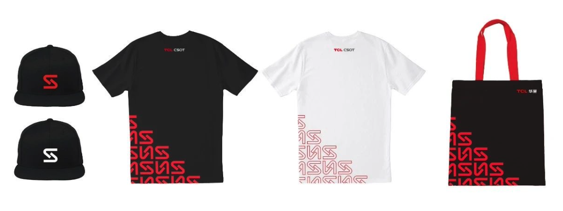
The refresh of the brand LOGO is equivalent to the continuation of the brand vitality, representing that the brand continues to grow upwards. We also expect more friends to know and understand the new LOGO and new image of TCL CSOT and grow with TCL CSOT.
